Strategic Branding for Communities & Causes

Crafting Brands That Unite & Protect
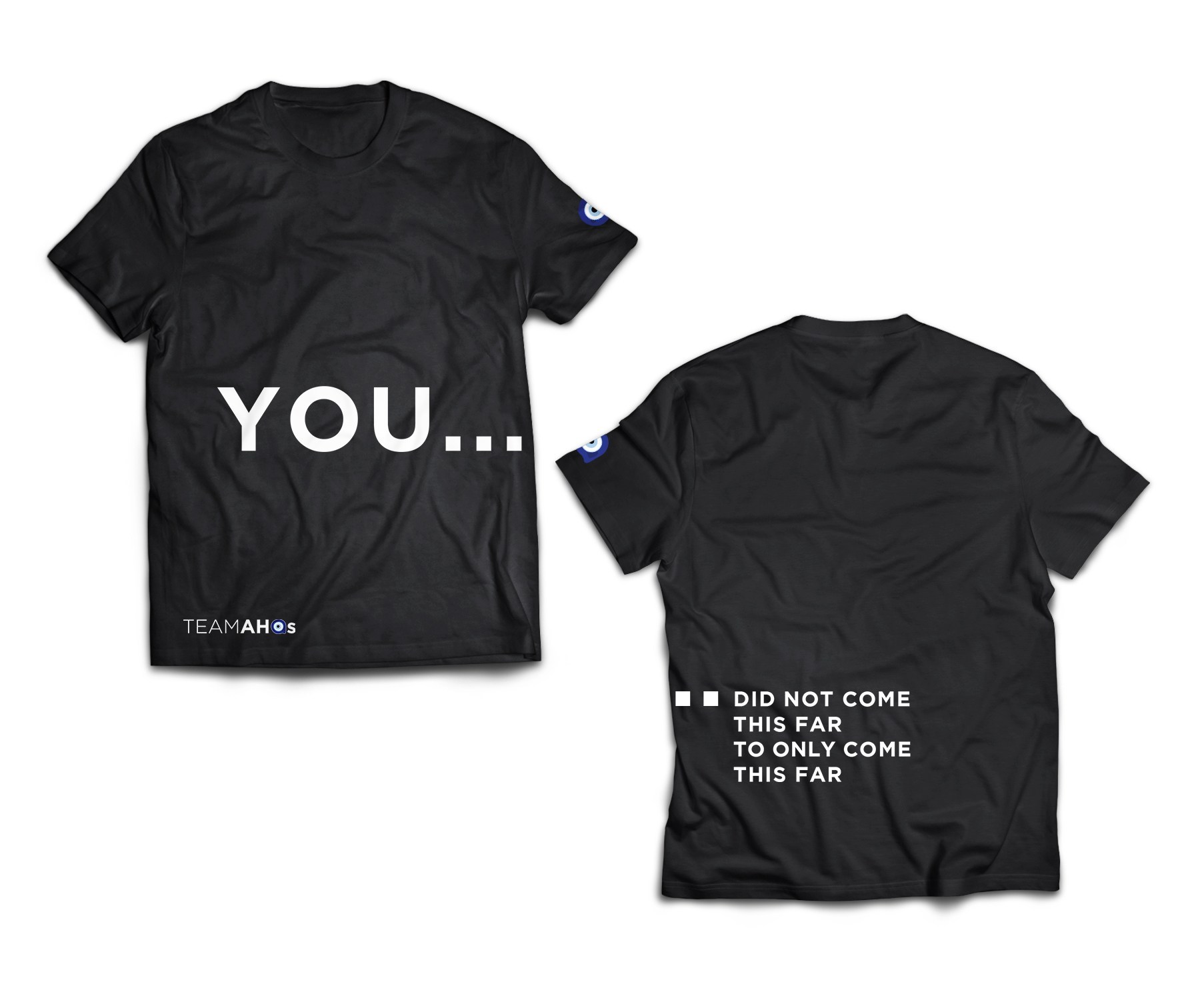
For AHQs, a philanthropic network, the challenge was honoring the client’s Middle Eastern heritage (via the symbolism of the evil eye motif) while avoiding cultural clichés. The client wanted a mark that felt organic yet minimal and through iterative sketching, I abstracted the protective symbol into fluid, interconnected forms—using gradient transparency to suggest both watchfulness and openness. The final mark feels simultaneously ancient and contemporary, with a color palette tested for accessibility across digital and embroidered applications.
Pillars of Service, a student-founded UW nonprofit addressing international social issues, needed an identity as impactful as their mission. I conceptualized a logo that transforms the organization's name into a powerful visual metaphor - using fingers as pillars to literally and symbolically represent support.The hand imagery serves dual purposes: it illustrates the 'pillars' in the name while communicating how individual acts of service collectively uphold communities. The clean, bold execution ensures instant recognition across fundraising materials and awareness campaigns, visually reinforcing their message that everyone has the power to support global change.